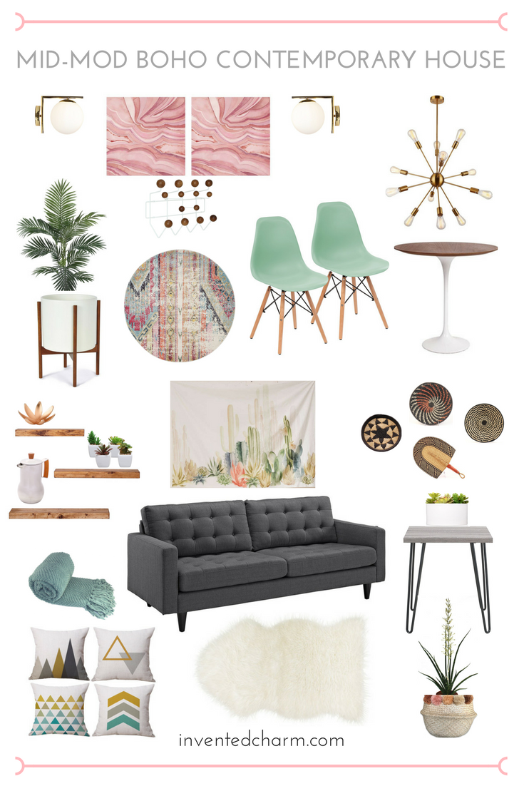
I already shared the design plans I had for a 1980s ranch style home, but today I’m back to talk about the other home we offered on and didn’t get. It was a 1973 contemporary ranch house with a stone exterior. Visually, the house just needed a lot more curb appeal. I know that a faux stone exterior might scare off a lot of buyers, but when I saw the low rectangular shape of the home, the big windows, and then the inside—I knew the house had so much potential. Here is a mood board I pulled together for a Mid-Mod Bohemian Contemporary House, and below the cut I’ll go into more detail room by room.
I was inspired to make this house seem like something you’d see in Palm Springs.
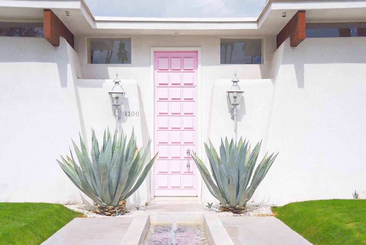
I was 100% going to paint my front door pink. And those agave plants are exactly what this stone house needed to bring more shape and interest to it.
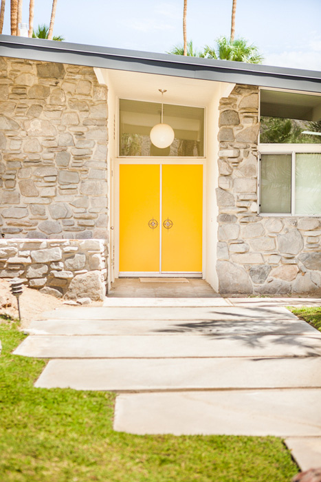
The inside of the contemporary ranch had a couple of globe pendant lights, and I had plans to hang one outside in the entry or possibly a sputnik fixture. If my husband put up too much of a fight, I would have compromised and painted the front door yellow. When we viewed the house it had an ugly white metal security screen, a red door with a crest knocker, and yellow glass side panels. The glass spoke to me, and the rest did not.
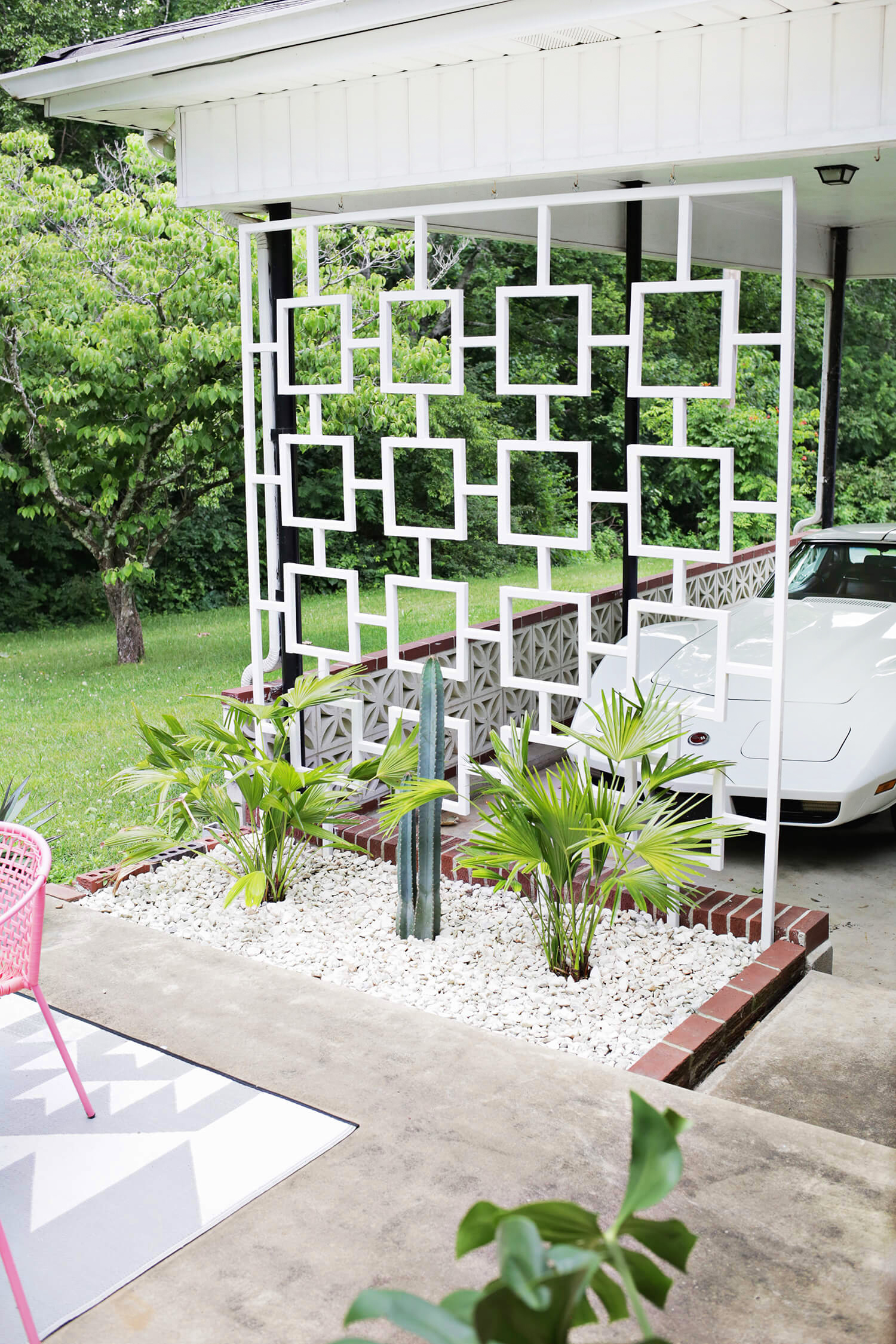
To break up the heaviness of the stone, I had plans to put up a mid-century inspired trellis in the front of the house.
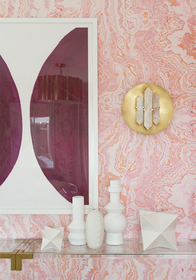
The entry way of this contemporary home had a low drop ceiling (how unfortunate), but the floor was this amazing tile that looked like slices of agate. I found this awesome room with marbled wallpaper to serve as my inspiration.
To the left off of the entry was a massive living room. While we viewed the house, my husband and I laughed about what we would do with the space. The contemporary home was the largest of the three we made offers on, about 2500 square feet with 4 beds/2.5 baths. Since one of the bedrooms was really set up to be an office, we had no need to convert the living space for work space like we did in the ranch style house. Instead, I dreamed up using the living room as a music room and play room.
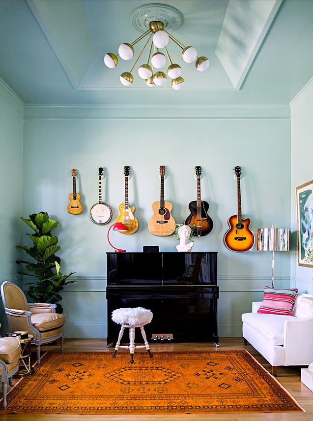
I have a keyboard that has been in storage for years, and between Nick and I we have two guitars (that we don’t play). Rory has also been amassing a musical instrument collection. Since the room was quite big, it could easily be split up into two distinct areas, one for music and adult conversation seating, and then a play area for Rory. Rory got a play kitchen for his second birthday after I noticed it’s his go-to toy at other people’s houses.
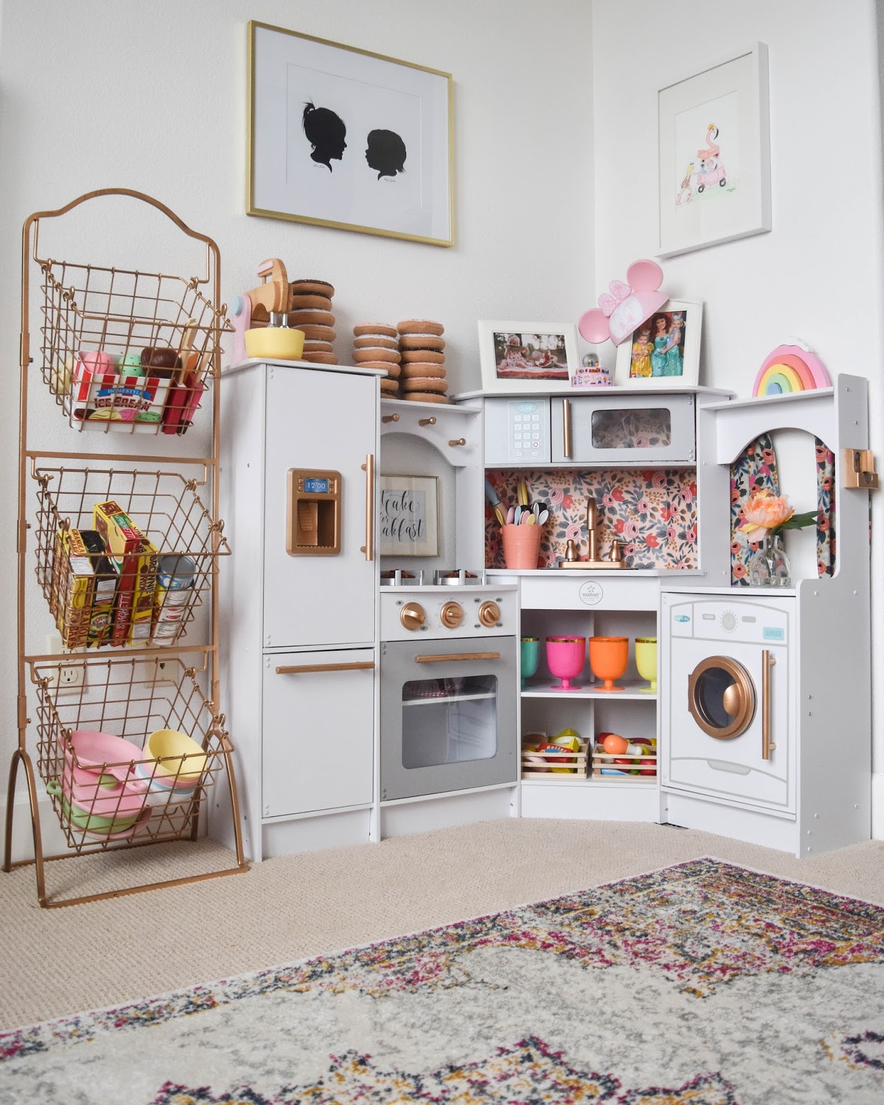
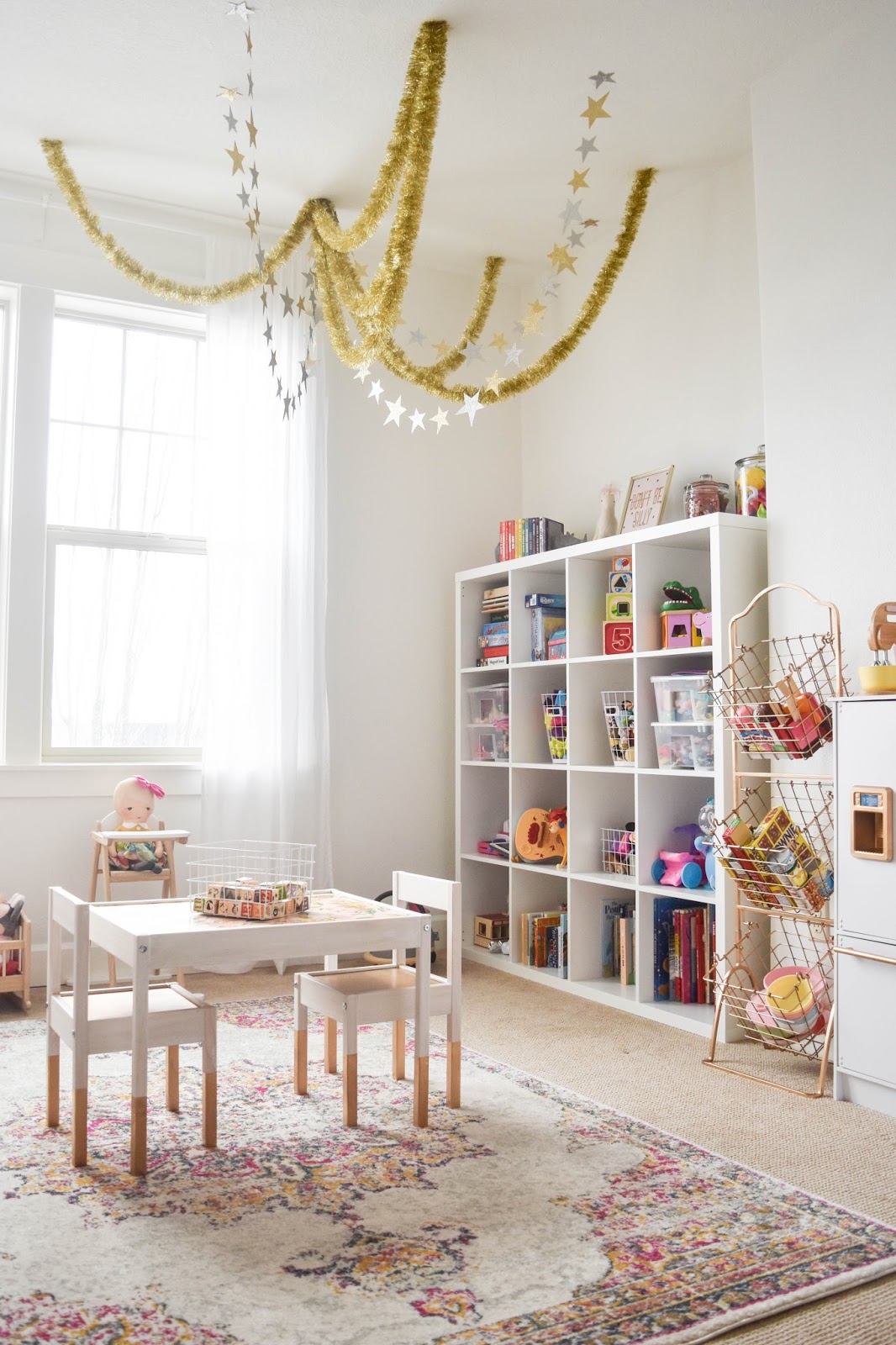
My kid has a lot of toys. We had a similar storage solution in our last home, but it was about half the size of the one pictured here. I either need to Marie Kondo or I need to buy a bigger unit.
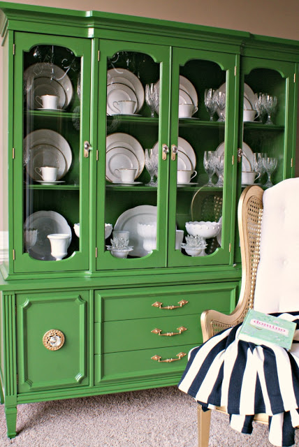
The dining room is right in front of the entry and had a couple truly funky things. First, there was a built in China cabinet in its dark 1970s glory, and a pass through window into the kitchen. My first idea was to paint that cabinet and use it to store my actual wedding China that is still in its original boxes. I was thinking Kelly green against white walls or another pretty color like yellow or teal.
I’m not sure I could pull off black walls, but I liked this really glamorous vintage dining room.
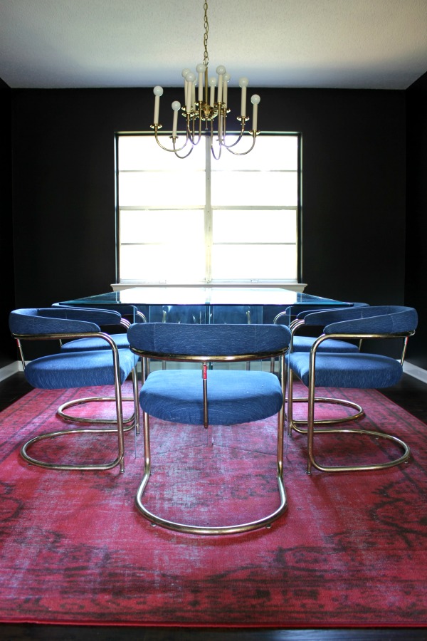
The cantilever chairs feel very 70s to me, which is perfect for a 70s house. The dining room definitely needed to be amazing since you see it right when you walk in.
Up next is the kitchen which overlooked the family room. The kitchen cabinets had recently been painted white, which were fine, but not spectacular with the hunter green Corian countertops from the 90s. Also not spectacular was the low ceiling in the kitchen with fluorescent lighting. We had dreams of opening it up and installing some beautiful pendants over the bar, and ripping out the hanging cabinets. WHY WAS THAT EVER A THING.
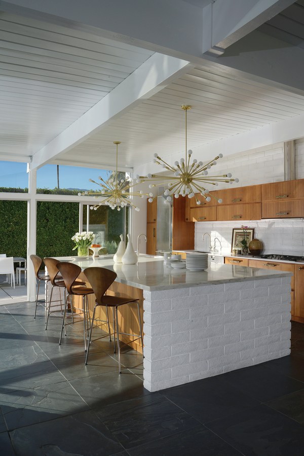
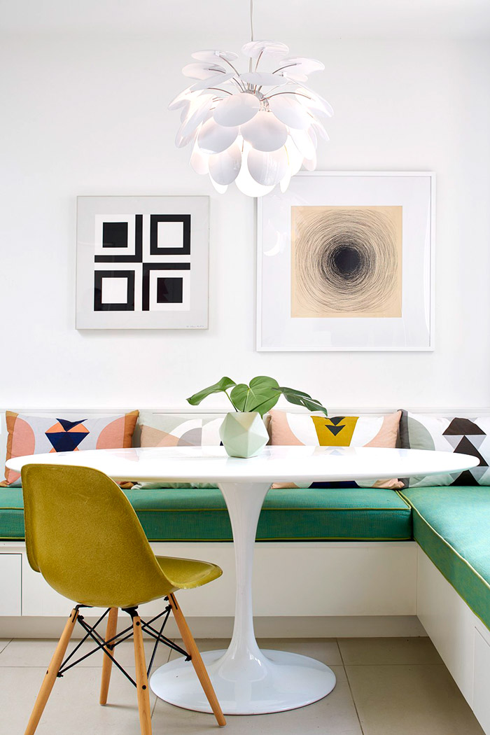
I love the mix of white and wood and the green from the outside. Since we couldn’t afford new cabinetry, I thought a great way to warm up the white kitchen was by replacing the countertop with butcher block. I’d keep the color limited in there since it wasn’t a huge kitchen. The was an eat-in area surrounded by windows, so I planned to really play that up. Just like in the ranch house I wrote about, I was excited to use a tulip table.
Probably my favorite part of the house was the family room. I fell hard for this room because of the vaulted ceiling, two glorious original mid-century globe pendants, and a ceiling-height stone fireplace. This room below is much grander, but just imagine it smaller and you’d have a pretty close idea.
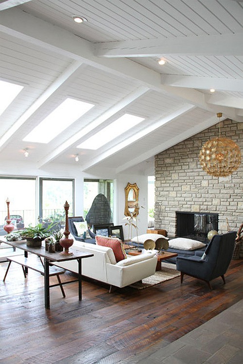
This is the room that really needed the least work. It already had great style with those globe lights and just needed our stuff to make it homey.
This contemporary home had a large mudroom with laundry facilities and a powder room. It was really more than I could have asked for. Those areas were original and had a lot of yellow and brown. I planned to tackle the laundry, half bath, and main bath on the other side of the house by getting as much reflective surfaces in those spaces as possible since none of those spaces had windows. I’d use subway tile and new white fixtures, and eliminate the old dark vanities that took up a lot of visual space but weren’t particularly usable. The house had tons of storage space (closets, pantries, a full storage room next to the garage), but the bathrooms were all very small throughout. No sense in keeping those spaces cramped with redundant storage.
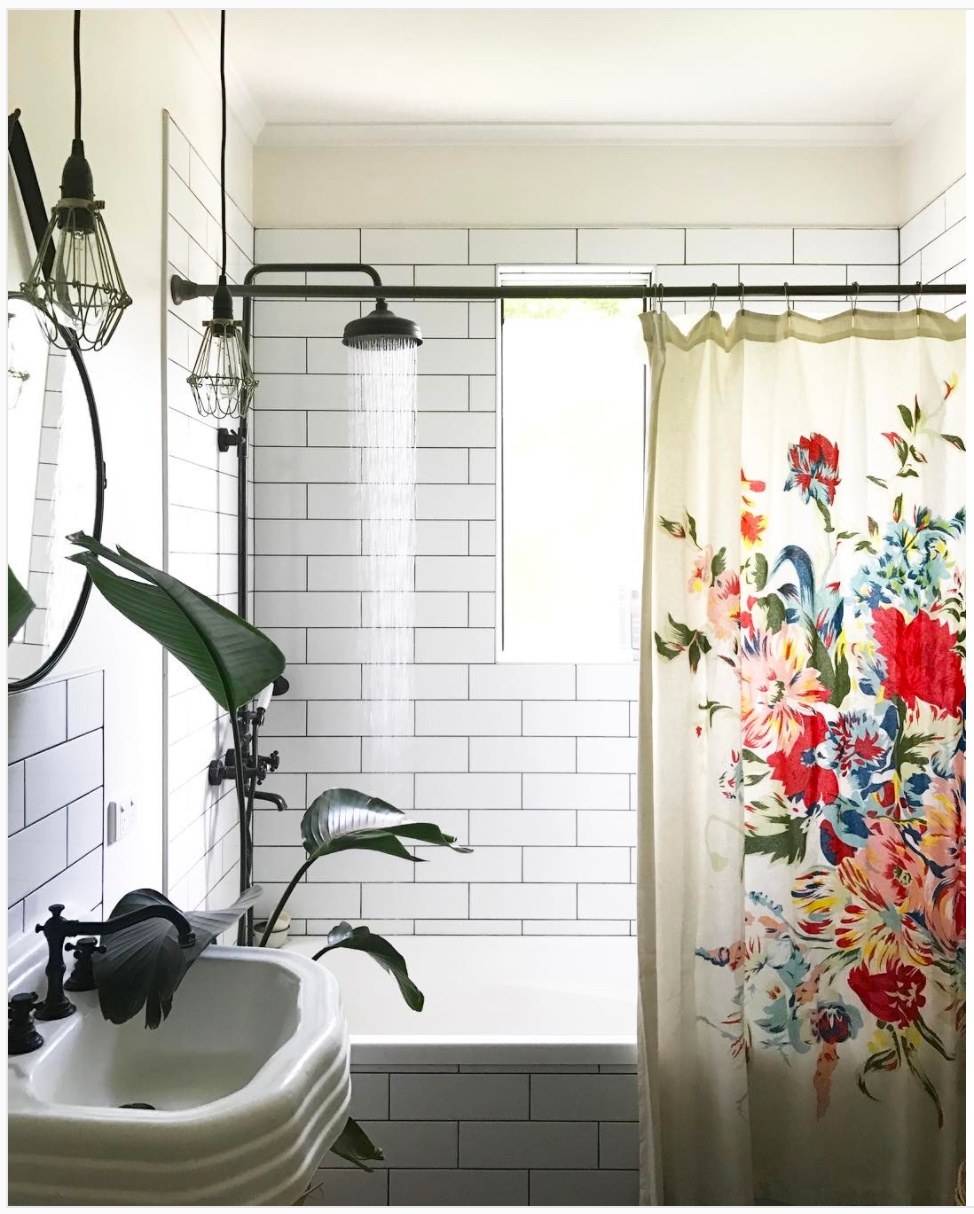
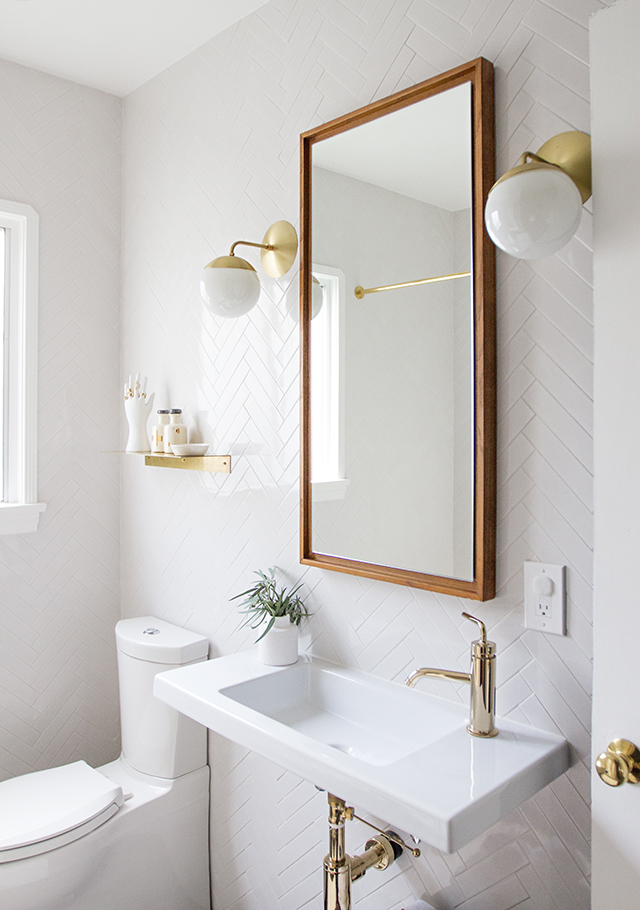
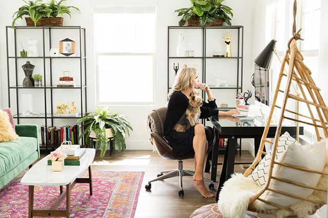
On to the bedrooms! As I mentioned before, this was a four bed house, so it was an obvious choice to have a dedicated office. I don’t think the space was quite as large as the one below, but it had great windows that gave the room so much light. My goal would have been to keep the space bright and airy and comfortable for working.
Rory would have gotten the bedroom facing the front of the house. This Rad Little Dude mood board by Lay Baby Lay provides the perfect inspiration.
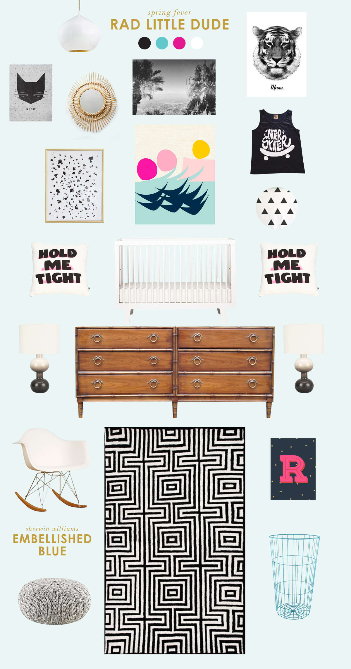
There would have been an extra bedroom we could set up as a guest retreat or use for exercising. But let’s face it, I had a lot a great intentions for this house and not the biggest budget so it may have just stayed empty.
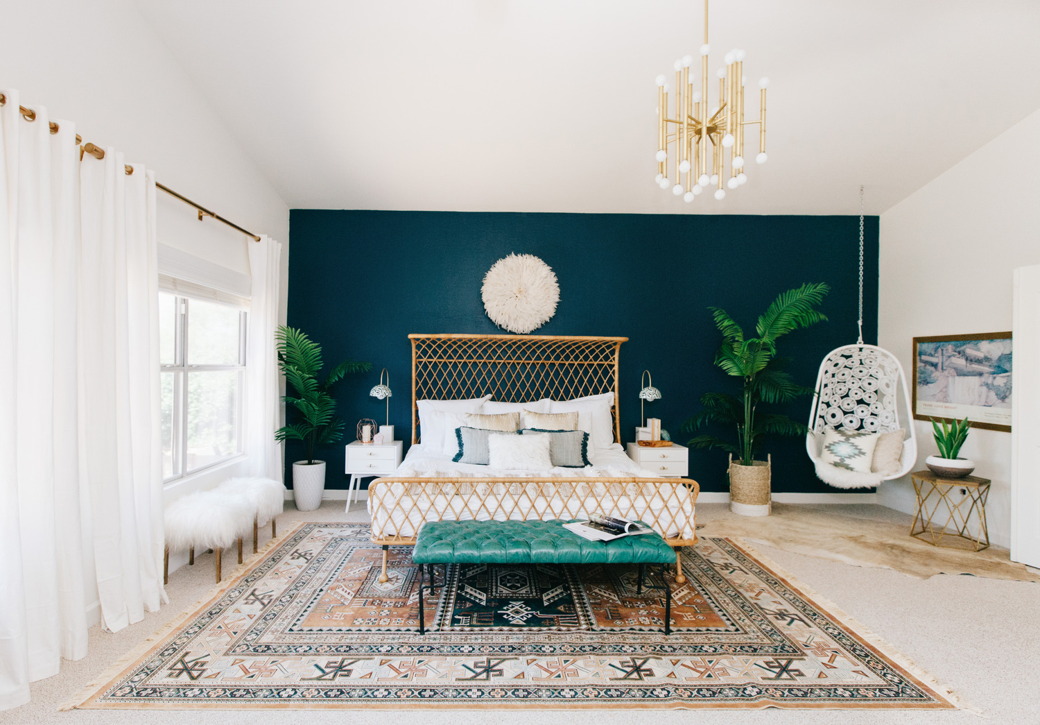
The master bedroom was big and had a sliding door to the patio and garden. In the ranch style house I was going to go light blue, but in this contemporary house I think it needed more drama. I love this dark blue green.
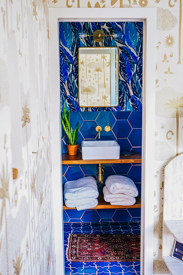
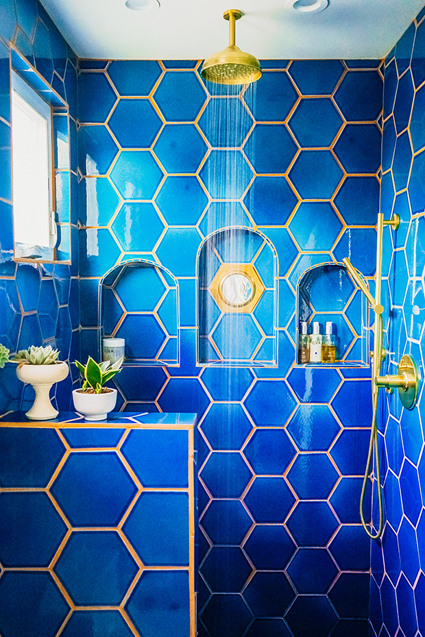
The master bath was right off the bedroom area. The dual vanity was technically in the bedroom next to a closet, and the toilet and shower were behind a pocket door. This was definitely not our favorite feature, but we knew it would be all the more critical to make it look nice. The shape of the bathroom was actually eerily similar to Justina Blakeney’s bathroom. I bow down to this gorgeousness.
I had a lot of fun thinking about how to give this contemporary home more personality and fun. It felt dated and like it had been a long time since anyone had given it proper love. I definitely think the property stretched my creativity a bit more than the ranch house, which was essentially move-in ready. I’m not sure how successful I was in coming up with a cohesive vision, but it definitely taught me I’m not afraid of mixing and matching pieces from different eras and parts of the world. I think this contemporary home from the 70s was aching for some mid-century cool, but I definitely wanted to keep the earthy 70s vibe by using a lot of texture, greenery, and global finds.
Shop the Look:
The following include Amazon affiliate links. If you click on one of the product links and make a purchase, I’ll receive a percentage of that sale at no cost to you. For a full disclosure statement see my Disclosures page.
Image Credits & Affiliate Links: Mid-Century Wall Sconce / Pastel Agate Print / Palm Silk Tree / Ceramic and Wood Plant Stand / Gumball Walnut Coat Rack / Round Bohemian Erased Rug / Brass Sputnik / Mint Green Chairs / Tulip Table with Walnut Top / Walnut Floating Shelves / Magnolia Ring Holder / Set of Four Succulents / Steel and Acacia French Press / Cactus Wall Mural / Black Star African Bowl / Black and Coral Ugandan Bowl / Black Zig Zag Ugandan Bowl / Ghanaian Hand Fan / Silver Blue Throw / Grey Sofa / Hairpin End Table / Round Ceramic Succulent Arrangement / Geometric Pillow Covers / Sheepskin Rug / Snake Plant / Pom Pom Basket
