Hey there! I’m here with an update about our Tudor house. We have been here a little less than a month and it’s been a whirlwind of projects and repairs. Most things are in a state of being half-completed or not started at all. Rory’s room is the furthest along, but still not quite ready for a proper post since I haven’t done figured out new artwork and a few key items haven’t even been pulled together.
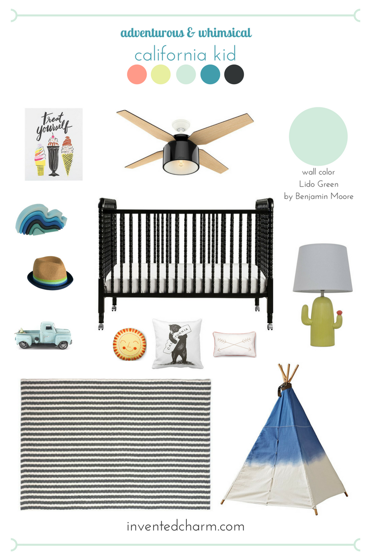
Before I get too far ahead of myself, here’s an inspiration board I came up with back in May right after we closed escrow.

Some of the following include Amazon affiliate links, which means that if you click on one of the product links and make a purchase, I’ll receive a percentage of that sale at no cost to you. All thoughts and opinions are my own. For a full disclosure statement see my About page.
Shopping Guide & Image Sources // Ice Cream Print / Ceiling Fan / Wall Color / Wavy Blocks / Multi-Strip Fedora / Vintage Truck Toy / Ebony Jenny Lind Crib / California Bear Hug Pillow / Sun Pillow / Arrow Throw Pillow / Cactus Lamp / Striped Rug / Dip Dye Denim Teepee
This is Rory’s first room of his own so I decided that I wanted it to be the first room done in the house. I chose adventurous and whimsical as my two key words to help me come up with the design. I tested out Lido Green and Italian Ice Green by Benjamin Moore after seeing so many fun minty shades on Lay Baby Lay and hanging out in the paint chip section at multiple hardware stores. Italian Ice Green almost looked white and didn’t offer as much contrast as Lido Green did with the existing trim color (an off-white that I’m not planning to change any time soon). Lido Green feels really fresh but it’s still neutral enough that this could be a shared room in the future if needed.
Once I started pinning images I realized I needed a theme to keep the look cohesive. I want the room to be special but not babyish. This isn’t really a nursery room, but he’s two and still in a crib so I want the room to transition to a big kid room when he’s ready. I decided to pay homage to our move from southern California to northern California, so I chose accessories that reference sunshine, the beach, the desert, camping, and classic cars (which is a big thing in my hometown).
The ice cream print (that I picked up on clearance from The Paper Source for MEGA cheap) really reminds me of my own childhood bedroom. When I was a toddler until about 6 my bedroom had ice cream wallpaper! The wavy blocks are so beautiful and sculptural and a nod to our years living in Santa Barbara. I can’t wait to hang up this three hook rack I picked up from Ikea in his room so Rory can display his beloved hats (boy loves his hats!). I love the little cactus lamp I got from Target. It reminds me of our family trip to Palm Springs.
I hemmed and hawed a lot while picking a rug for Rory’s room. I decided to lower my stress level by sticking to a black and white color palette for all the rugs in the house. I love how graphic they look, plus I can swap them throughout the house if I ever want a change. The rug featured above by Hook and Loom was a real contender, but I ended up with this one from Ikea. One of the most fun things I’m looking forward to putting together is the Dip Dye Denim teepee from Land of Nod. Rory got it as a Christmas present and it’s been in a box ever since just waiting for a room. I’d like to get some throw pillows so he has somewhere soft to lay while he reads and plays.
I painted the room myself, with a little help from my dad, and the existing furniture we had is in there already. I haven’t had a chance to frame or hang artwork or buy the rest of the accessories, but maybe this will give me a final push to get it done.
What do you think of my first attempt at designing for our Tudor home?