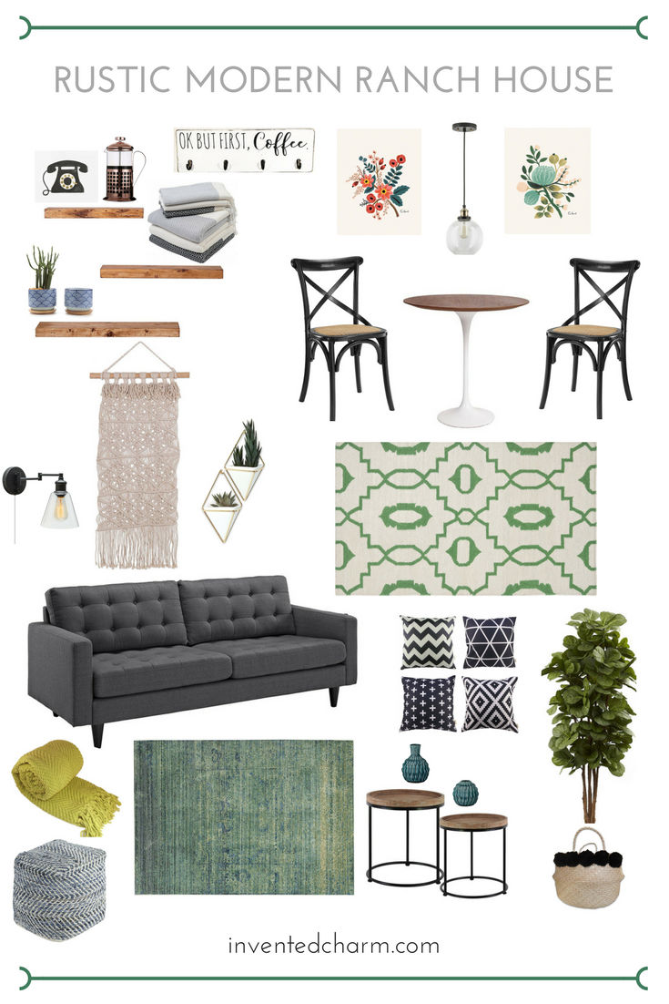
I am very excited about where we will end up in just about a week’s time, but that doesn’t mean I can’t mourn for the homes I almost got but didn’t. I thought I’d walk you through some of the ideas I had about two different homes we made offers on to buy. Today I’ll be sharing my interior inspiration for a 1986 ranch style home. Here is a mood board I pulled together for a Rustic Modern Ranch House, and below the cut I’ll go into more detail room by room.
This house had a dark reclaimed brick exterior with redwood siding around the picture windows. There were vaulted ceilings in the foyer as you enter, and in the family room. The kitchen and bathrooms were updated with a nice neutral ceramic tile, a band of accent tile, and warm wood cabinetry. It wasn’t my aesthetic exactly, but I appreciated the quality workmanship and that the house was almost entirely move-in ready.
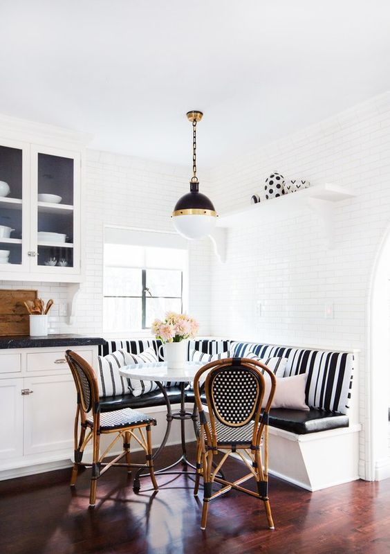
I was inspired by the built in wine fridge right next to the eat-in kitchen area to give the room a cafe like feeling. My idea for the eat-in area was to do bench seating along two of the walls, use a round tulip table to give a nod to mid-century ranch homes, use a pair of French bistro rattan chairs to give the space a cool vibe, and then hang a statement pendant over the table.
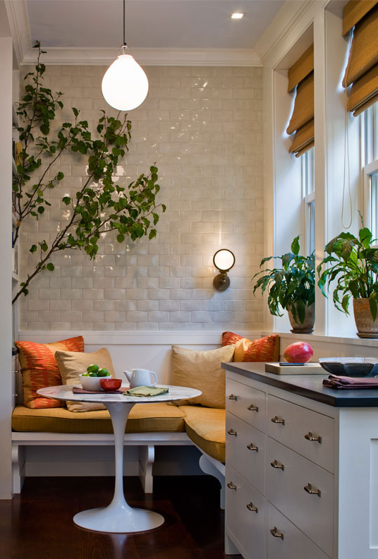
Shay Mitchell’s house is amazing and I definitely pinned this, swooned and coveted.
The family room had real hardwood floors, and the windows and door trim were all solid oak. Again, the wood tones may not have been my pick, but they were really beautiful in the space with all that natural light. This image below definitely inspired me to take the ranch home out of the 80s by embracing the wood but giving it a more rustic and modern vibe.
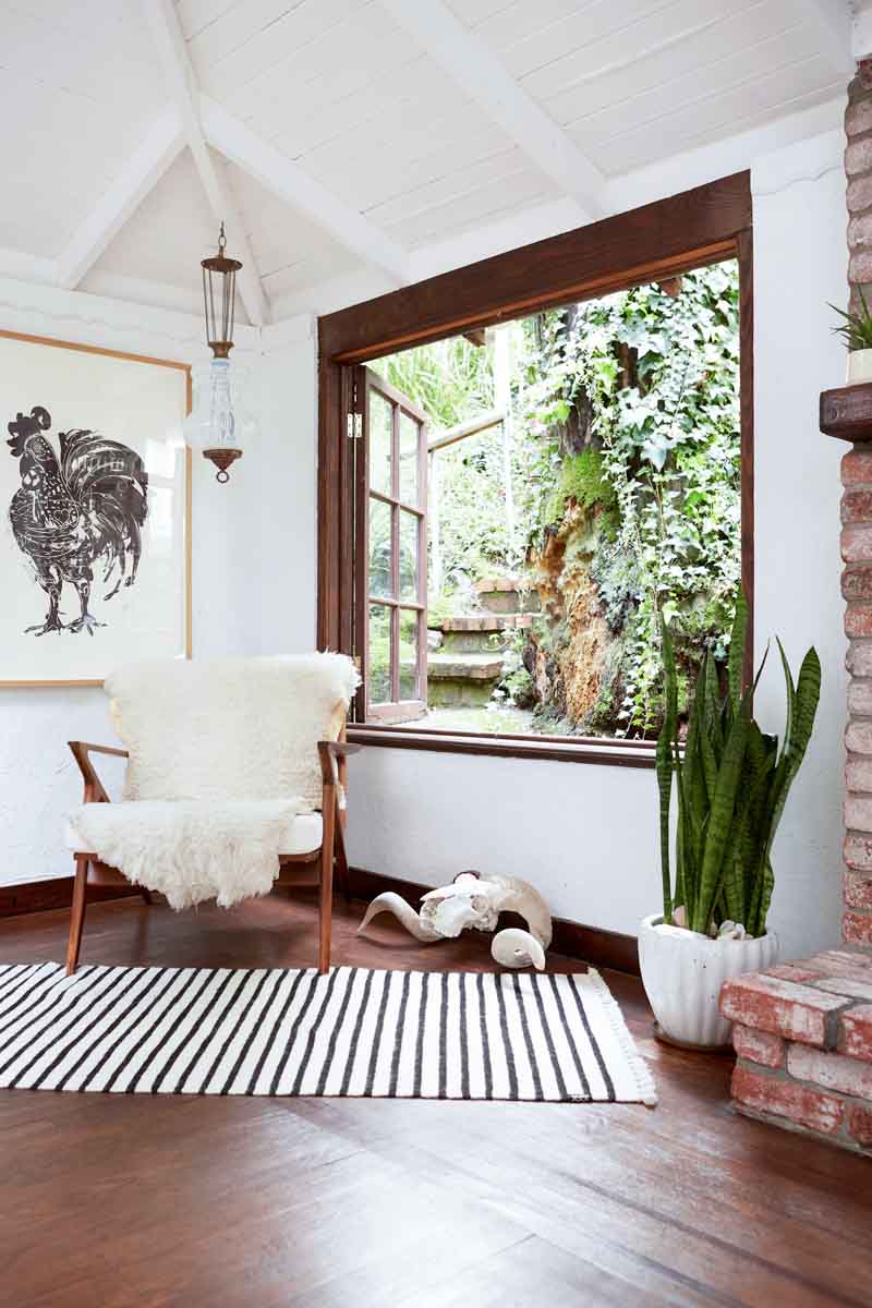
I could see my grey mid-century inspired sofa going beautifully in there, atop a traditional wool rug, and keeping the accents graphic and the colors neutral.
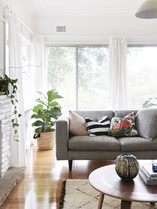
My idea for the living and dining spaces were the most exciting part of the plan. Since both Nick and I need to work from home, I pictured making those spaces over into a large home office that could easily convert to a guest room or a dining room as needed. There was a cased opening off of the foyer that was screaming for a barn door or possibly even a French door. We thought we could use our rustic X-back bookcases to house our library and for storing all of our work things, and then set up our desks in front of the windows, either back to back or separate. We also have some Ikea storage cubes that could double as a buffet. We could easily transform the space by clearing off the tops of the desks and centering them in the room for a dining table. I’m blown away by this transformation from Wouldn’t it be Lovely.

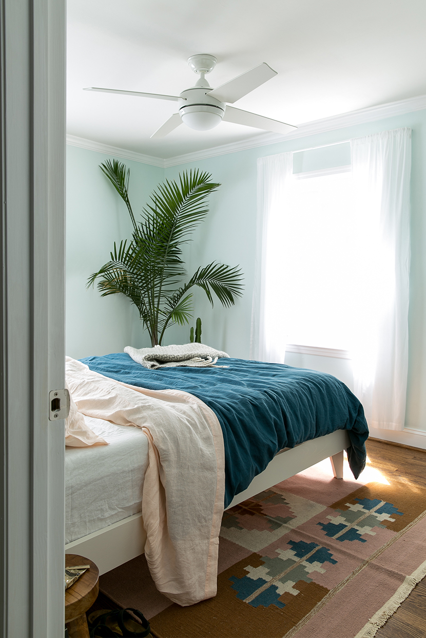
The master bedroom in this house was enormous and it had a drool worthy closet. All it needed was a fresh coat of a paint. The perfect backdrop for my decor is probably a pale blue. The Fresh Exchange used Snowdrop by Behr. I think it’s a great choice in almost any master bedroom.
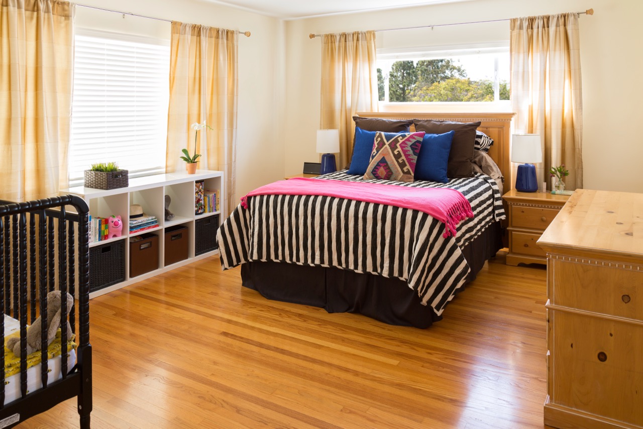
Even when we move into our Tudor style house I am planning on keeping my bedding because I finally figured out color combos I love. Here’s my bedroom in Santa Barbara styled for when we put it on the market. I mixed and matched two different bedding sets for this shoot. In the summer we had a black and white striped thin quilt, and in the winter months I used a brown silk duvet. Here I have the black and white quilt, paired with brown silk shams, vibrant blue accent pillows (from Costco’s patio decor section), and a wool kilim pillow that was a major splurge.
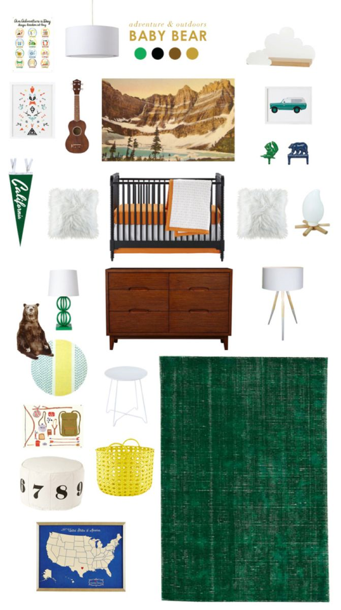
All of the bedrooms in this 80s ranch home were a good size, so it gave me plenty of options for Rory’s nursery. He’s not quite ready to transition to a big boy bedroom, so I had planned on just transferring most of the furniture and bedding and updating with artwork. I love all the mood boards by Lay Baby Lay. Baby Bear seemed like a good fit for this house since the carpet was kind of a washed out green (not my first choice, but I wasn’t going to rip out expensive newish carpet). Rory’s crib is actually that exact one, a black Jenny Lind. I love how I was able to keep my inspiration cohesive, even in a kid’s room.
That about does it on the 1980s Ranch house that was almost ours. I wanted to update the house with a more modern vibe while still keeping it rustic and neutral. The house had great bones. I really had a lot of fun dreaming about this house and pinning images. This house is going to make its new owners very happy.
Shop the Look:
The following include Amazon affiliate links. If you click on one of the product links and make a purchase, I’ll receive a percentage of that sale at no cost to you. For a full disclosure statement see my Disclosures page.
Image Credits & Affiliate Links: Walnut Floating Shelves / Telephone Print / French Press / Coffee Sign / Turkish Towel Set / Ceramic Planters / Coral Botanical Print / Industrial Pendant / Blue Botanical Print / Bentwood Dining Chair / Tulip Table with Walnut Top / Ivory and Green Rug / Industrial Sconce / Woven Scroll / Wall Vessel / Grey Sofa / Black and White Pillow Covers / Citron Throw / Chevron Pouf / Watercolor Green Rug / Round Nesting Tables / Short Fluted Teal Vase / Stout Teal Vase / Faux Fiddle Leaf Fig / Pom Pom Seagrass Basket
I feel like I’ve been house hunting for a lot longer than the actual hunt, but I guess that’s what happens when you’re addicted to Zillow and Pinterest. Speaking of, come follow me on Pinterest if you’re interested in home design, food, and travel! In my next House Mourning post, I’ll share my inspiration for a super dated 1970s contemporary home.
