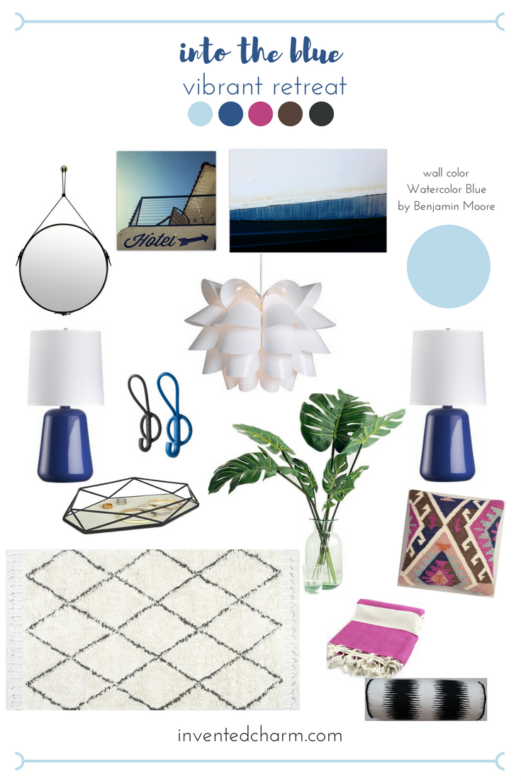
It’s been slow going at the Tudor House, but I’m finally back with an update. I have been mulling ideas over for our master bedroom and finally put together a mood board for inspiration. I decided that I want my room to function like a hotel room. It needs to pull double duty and be a place where I can rest and work. I don’t want the room to be cluttered, and I want everything in there to feel purposeful and peaceful. I came up with the concept of vibrant retreat.
Some of the following include Amazon affiliate links, which means that if you click on one of the product links and make a purchase, I’ll receive a percentage of that sale at no cost to you. All thoughts and opinions are my own. For a full disclosure statement see my About page.
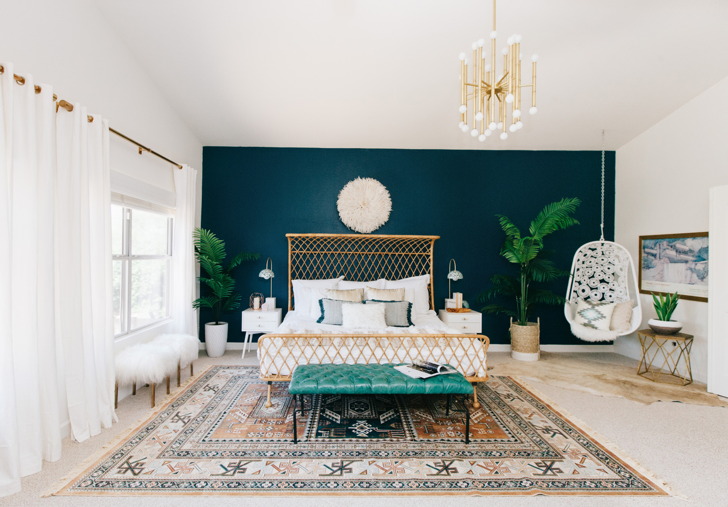
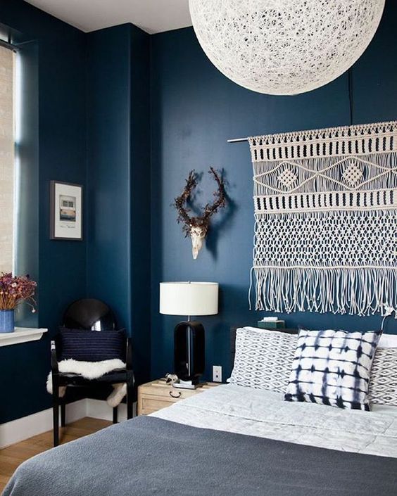
I kept coming back to the idea of a blue room. I initially was very keen on darker shades of blue after seeing these stunners on Pinterest.
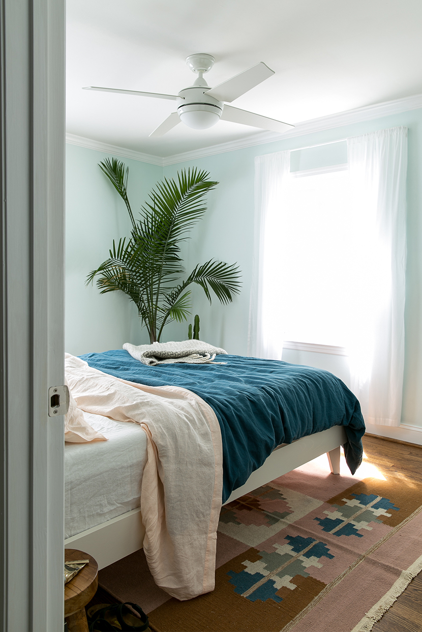
I brought home some paint swatches and ultimately decided I wanted a bit more contrast with the existing accessories I already owned. The first color I tested was Ocean City Blue by Benjamin Moore, but after living with two rectangle swatches on my walls for a couple months, I decided it had too much green. Since the room is already green, I really want to get away from it. I want the room to feel light, and it does have a lot of windows and doors, but the length of the room makes it so that one half is by far brighter during the day and then it looks like a dungeon after the sun sets because that side of the room has a fan and no overhead lighting.
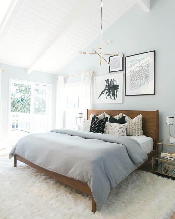
I looked back at my Pinterest boards and found these lighter blues a bit more to my liking.
I started looking online using the Benjamin Moore site. I decided I wanted a more true blue, but very light. I stumbled upon Watercolor Blue after just clicking on random paint swatches. I liked that the similar shades tool shows very true blues with very little grey or green. I felt fairly confident that this was the shade for me after I saw this color used on Ballard Designs’ How to Decorate blog. I think I have mentioned that I am a regular listener of their podcast! I love the tools Caroline provides on the blog, like specifically identifying the paint colors used in their catalog (they shoot in real homes). They used Watercolor Blue and I really like how it can go very traditional or contemporary and pairs well with a variety of colors. Look at it in this foyer styled with a green velvet chair and a leopard print pillow.
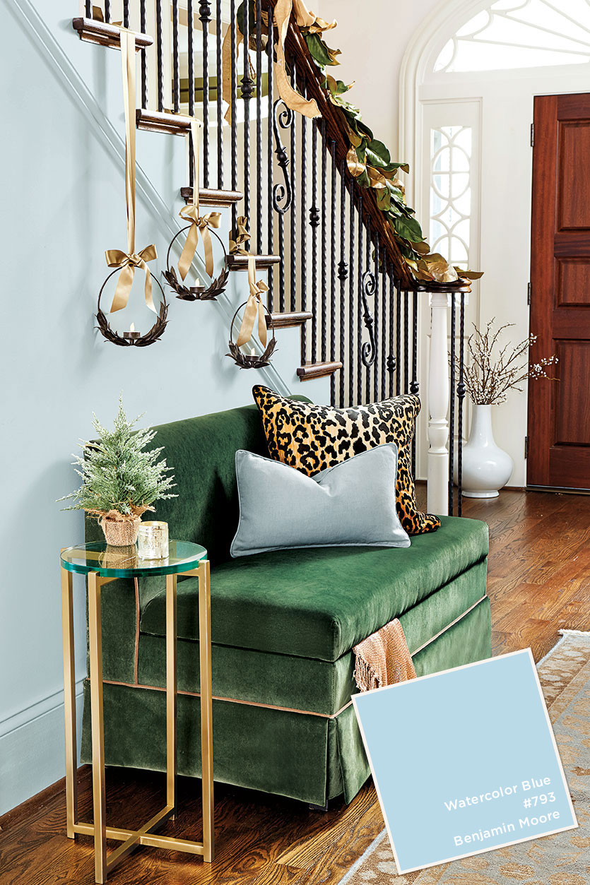
I just picked up a sample pint today and it’s drying as I write this. I am so excited! In case you’re interested, here are the Benjamin Moore and corresponding hex colors I used in the mood board, all via Benjamin Moore: Watercolor Blue, #badae8; Blue Suede Shoes, #305789; Hot Lips, #bd4380; Barista, #59433b; Black Satin, #323536.
I don’t have the budget for new furniture, and I still like quite a few of the accessories from my previous bedroom. Here is a look back at our bedroom in our condo.
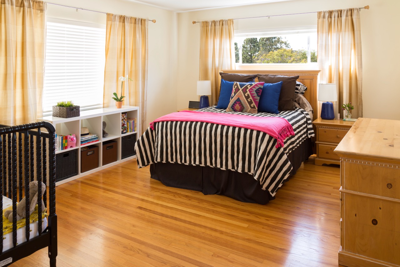
There was a mish-mash of styles, but I think I made them work. I really love my blue lamps from Crate & Barrel (they were a wedding gift from six years ago), and the pink wool kilim pillow I got from Cost Plus last fall (featured at The Jungalow) and I knew I wanted to use them as a jumping off point. I want our new master bedroom to look harmonious. And as I said before, I want it to feel like a retreat. I think the word is overused, but that’s probably because we are all looking for the same thing—we want a space where we can escape to and rest and dream. In many ways, this feels like my definition of minimalism! When I saw this Hotel print by September Wren (one of my favorite Etsy shops), my vision really started to come together.

Shopping Guide and Image Sources // Round Mirror with Faux Leather Strap / Vintage Hotel Sign Print & Abstract Boat Print by September Wren / Knappa Pendant Light / Blue Ceramic Lamps by Crate & Barrel (old), similar by Safavieh / Avsiktlig Hooks / Umbra Prisma Jewelry Tray / Monstera Artificial Stems / Marrakesh Shag Rug / Pink Wool & Cotton Kilim Pillow / Pink Turkish Throw / Black & White Bolster Pillow by Cleusa Sordi Decor
While I was at Ikea I picked up the Knappa pendant and we installed it with a Westinghouse kit from Amazon. I really like the sculptural feel of it, and it adds a focal point without breaking the bank. The project cost about forty dollars, and I think it makes a huge impact. I definitely need to buy a mirror (trekking to the bathroom is a real pain), and I like the round trend. The hanging leather strap mirror really gives it an industrial/well-traveled vibe that I like, but I supposed I could reinforce the nautical theme if I went with a rope-hanging mirror. I ordered the 8×10 Marrakesh Shag rug from Rugs USA a while back and it’s been sitting rolled up in my living room. An area rug is one of the few investments we are able to put into this room. We’re just waiting for the bedroom to be painted before we lay it down.
I’ll be back next week to share more details about prepping the room for painting!